Showing posts with label Arlington Artists Alliance. Show all posts

Friday, June 21, 2019

New Vs. Old: A True Face-Off! (Guest Post by Ian Vance, Part 3/4)

New Vs. Old: A True Face-Off!
Part 3 of 4
Author: Ian Vance, Intern with Arlington Artists Academy at Gallery Clarendon. 

Hello again, it’s the planet’s most talented illustrator here again for another update on my experience learning how to draw. During my previous posts, I focused on reading through Drawing on the Right Side of the Brain’s first half, learning proper contours and proportions, focusing more on relative size and distance rather than the actual objects I’m drawing and what the whole picture should look like. This time, though, I was more focused on learning to apply that to drawing faces. 

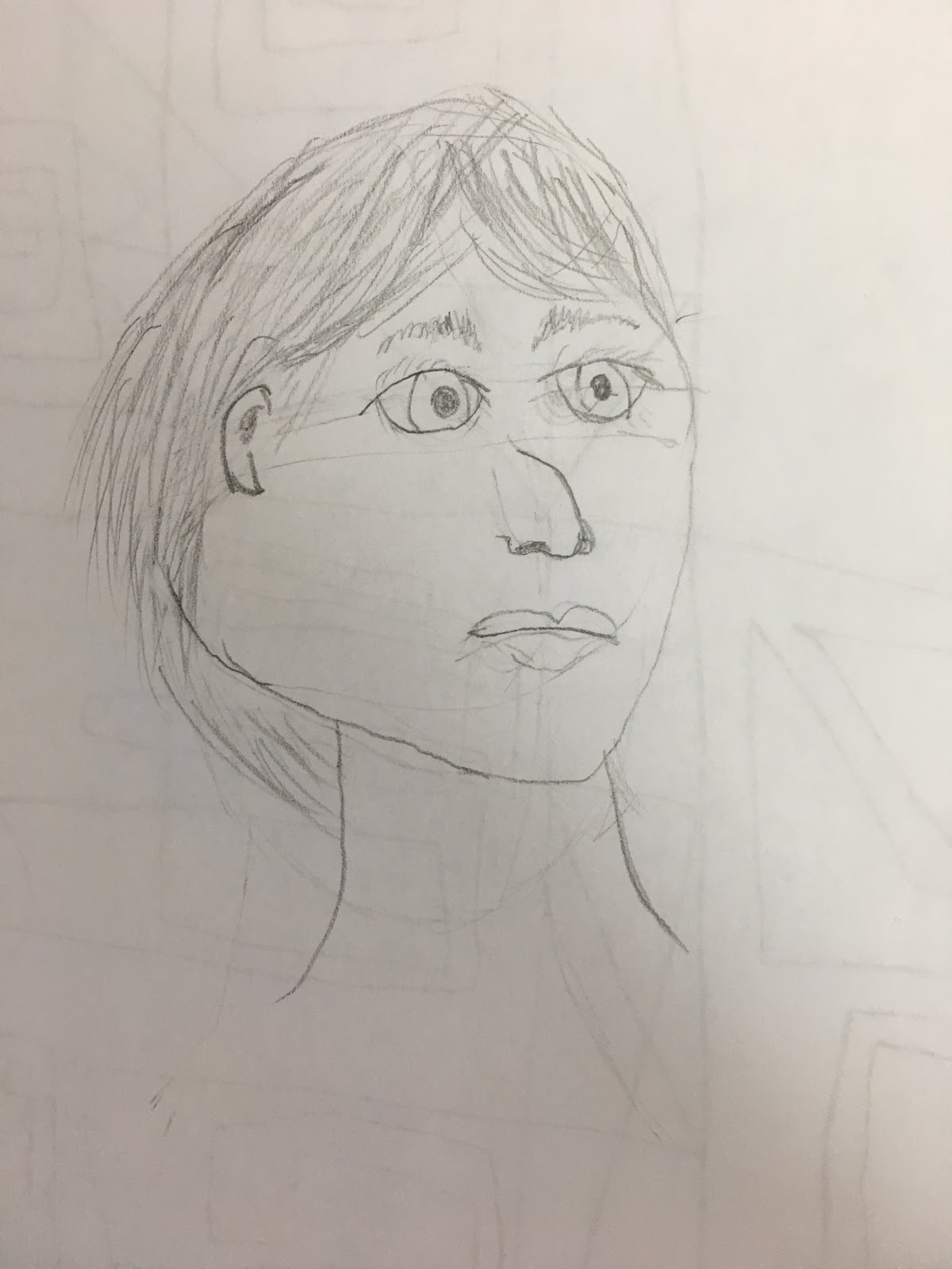
If you’d recall the first exercise I did, I was to attempt to draw a picture of a face to compare later on. It definitely had a fairly ok facial resemblance, but lacked proper anatomy or… good drawing to improve it in a practical manner. 
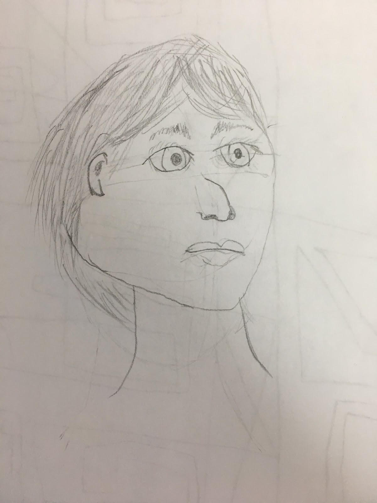
For all the criticism I gave this drawing, though, I’m starting to like it more, and not just because it has a comically blank stare. It actually looks somewhat proportionally sound, if not a little cartoony. 
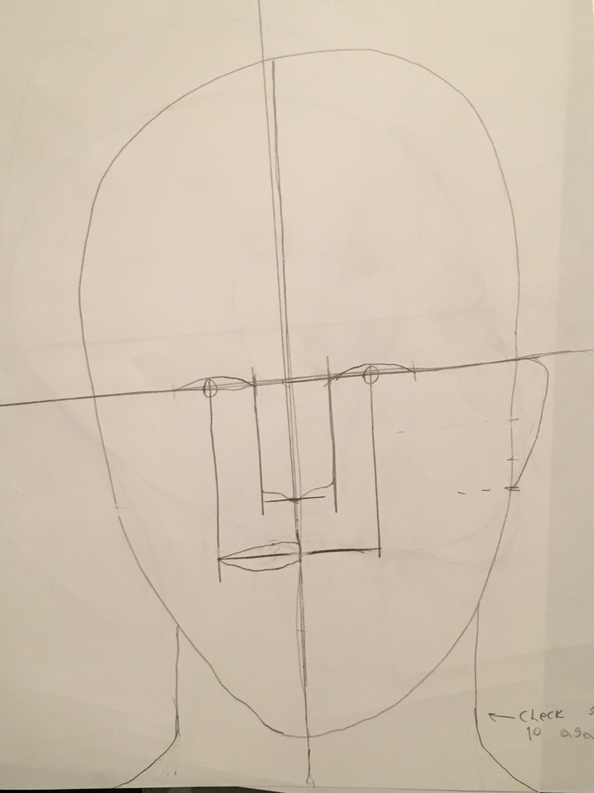
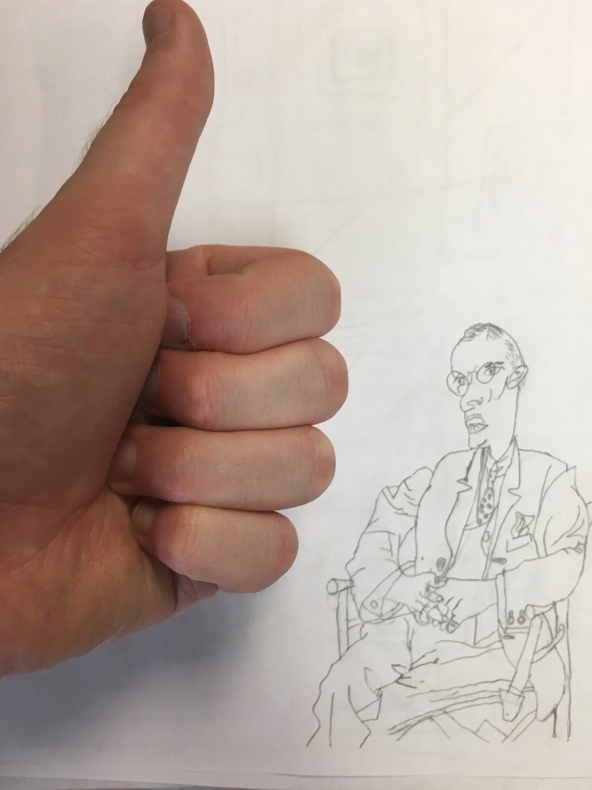
  These are some of the reference drawings that I copied down for facial and head anatomy. The front-facing subject had a lot of focus put on the position of parts in relation to each other, while the side-facing subject had focused more on their position in relation to the part of the head. That’s why the front facing-shot is more focused on the parts of the face rather than the oddly-shaped head, as is true of the inverse for the side-facing shot. 

These two were drawn to help me get better acquainted with proper facial anatomy and how to draw a head less than badly, but as I have learned over the course of these blogs, the best way to improve is through practice. The first practice exercise invoked drawing a side-facing model. 
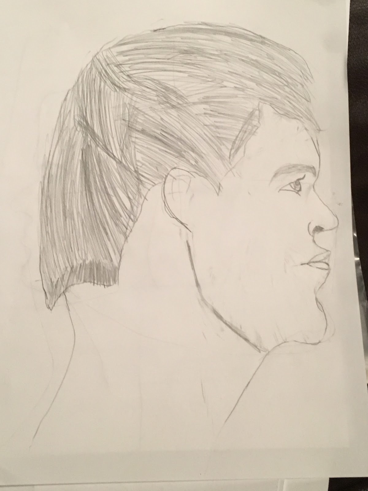
Is there a direct opposite to the word ‘yikes’? 

Okay, so the hair shape did not turn out well, no doubt, but this is still a pretty significant improvement from before! Rather than making what appeared to be a strange-looking character in an Adult Swim cartoon, I managed to finally get at least a decent amount of realism into my drawings. Bear in mind that while it may sound odd that I’m this happy about a sub-par drawing, with the art skills that I had prior to writing this blog, I probably wouldn’t have been able to make a remotely realistic drawing. Granted, this is still far from good realism, but it’s undeniably a step forward. 

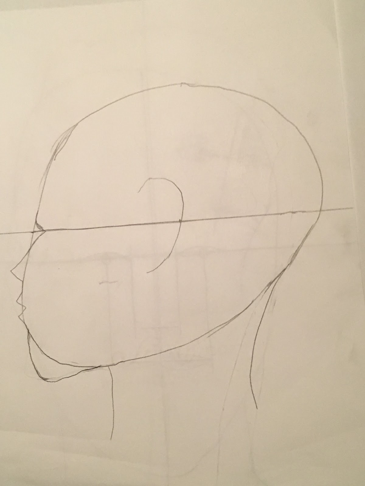
Lastly, I would like to mention a method that helps a decent deal with drawing the shape of the head: negative space. Seen below is an example of the start of a practice exercise (which will be finished by the next/final blog update). 
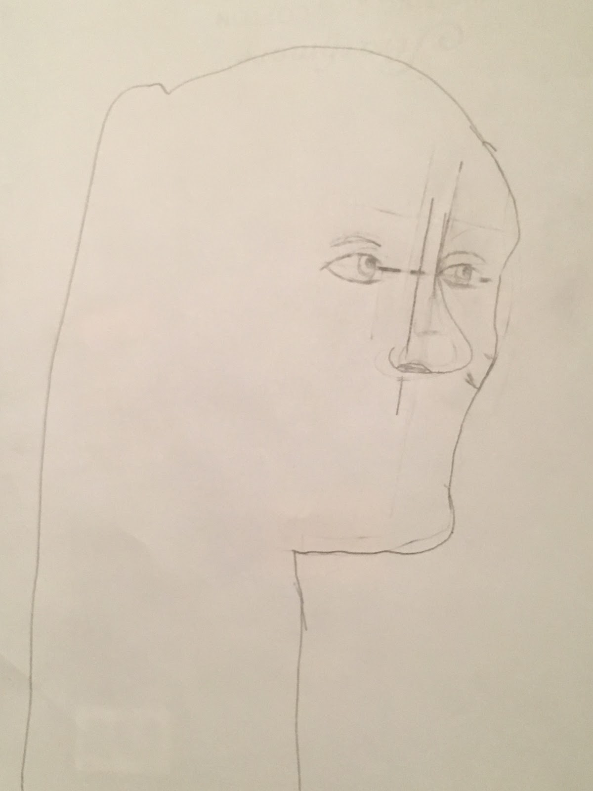
Yes, I’m aware that the neck is too long. Yes, I agree that this looks like a strange alien with that error here. Yes, I also think that it’s funny. Strange neck aside, the reason that the head is shaped like an earbud with eyes is that the model is in three-quarters view with a ponytail and long hair. The shape would have been rather troubling to add on to a standard head shape, so the more suitable method (in my opinion, at least) is to draw the negative space around the head, making the shape more clear and just adding the hair in later once the face is complete. 

That will be all for today. Next time, I’ll be finishing up drawing faces and learning proper shading, alongside it being my final entry. Thank you all, and take care!

Tuesday, June 11, 2019

Edges, Chairs, and Shaky Hands- Oh My! (Guest Post by Ian Vance, Part 2/4)

Edges, Chairs, and Shaky Hands- Oh My!
Part 2 of 4
Author: Ian Vance, Intern with Arlington Artists Academy at Gallery Clarendon. 

Hello again, readers! I’m here to share the experience of someone with little natural drawing talent learning to do just that. I always somewhat knew that there would be some improvement with learning a new and more effective method of drawing, but what I find most interesting is how somebody who could be considered a ‘bad artist’ has the ability to make some pretty sweet illustrations, so long as they just get into the right mindset. 

I’ve said it once, and I’ll say it again:
Yikes
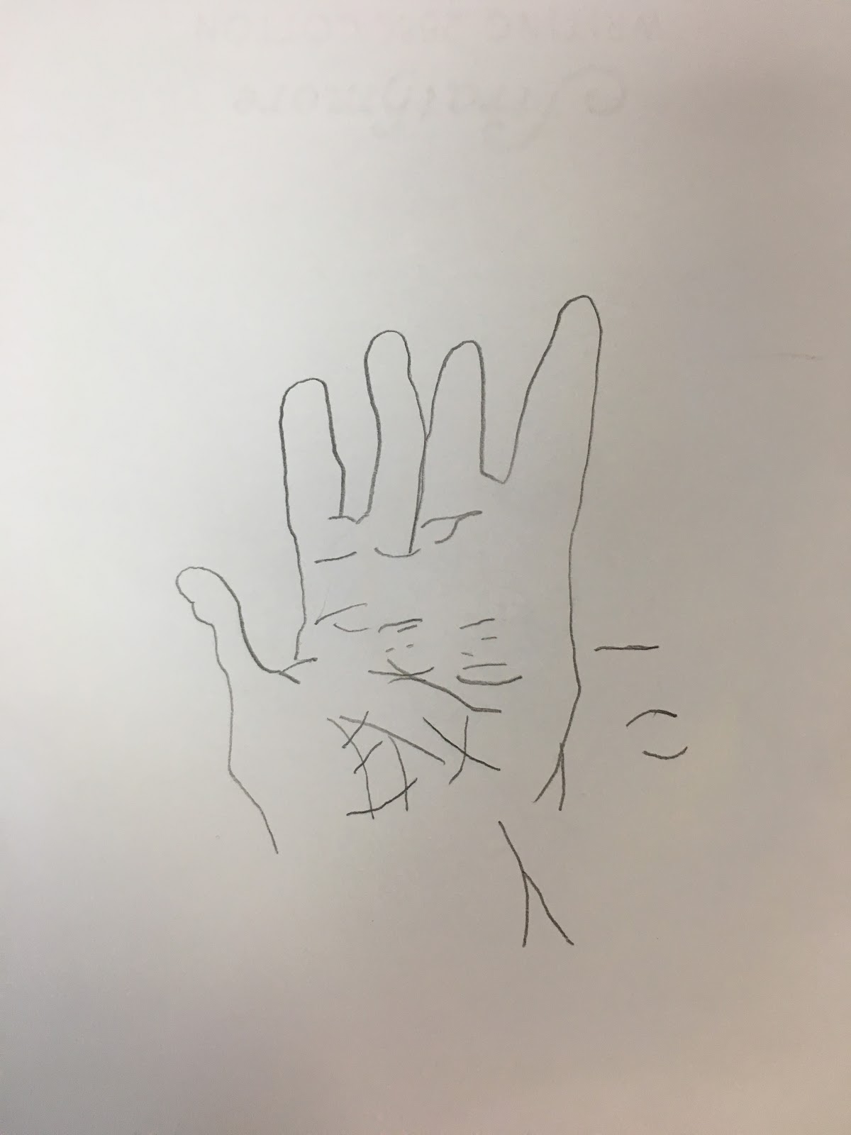
Although I got the basic idea when doing the work shared in the last update, it became noticeably more apparent when I was working on some of the later exercises in Drawing on the Right Side of the Brain by Betty Edwards. One such method was drawing contours, or edges as they are perceived by the viewer. The book detailed two types of contour drawing: Pure and Modified. Pure contour drawing is what I would consider the more difficult method of the two. Basically, you slowly draw every contour you see on an object without actually looking at what you’re drawing, matching the slow movements of your eyes across the edges with the movements of your pencil. To practice this, I tried doing this with my hand. Of course, this was likely going to only barely resemble a hand, but the point is that the contours themselves actually look fairly detailed, despite some of the skin folds not being on the hand.


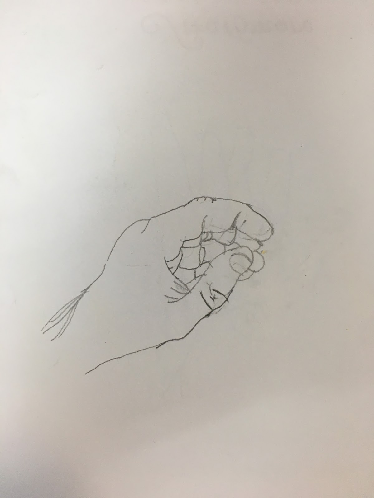
Next up, there was the practice of modified contour drawing. This is basically the same as pure contour drawing, but this time, you are allowed to glance at what you’re drawing from time to time. Once again, I did a drawing of my hand. 

Once again, while it is not perfect (or particularly good), it’s a good deal more detailed from what I can usually put on paper. It also nicely displays the benefits of drawing simply from observing the lines and spaces, rather than labeling each part mentally. Had I done this in a more ‘left-brain’ fashion, it would have likely looked much worse. 

Another thing that came up was the process of working with negative space. To put it very simply, negative space is basically the shape that the empty areas around the subject being drawn. The book details the method of viewing the negative space as individual shapes and drawing them instead. 

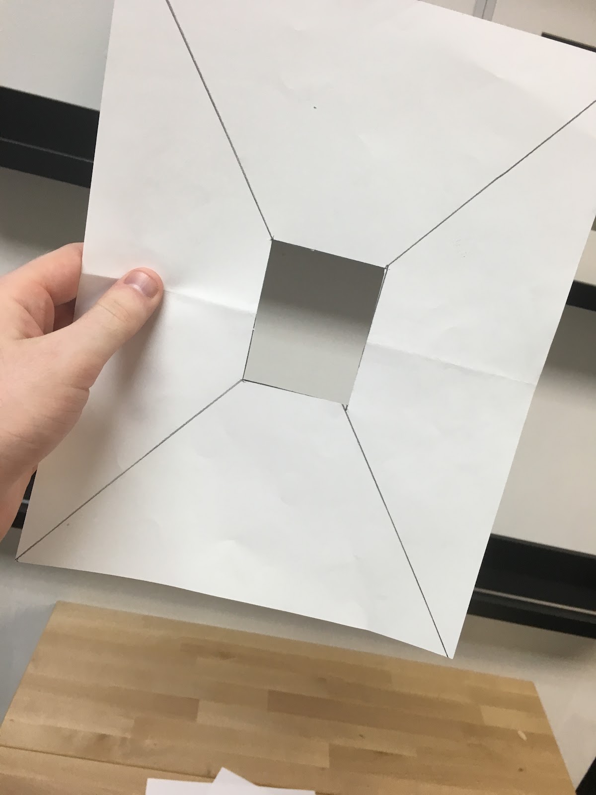
In order to do this, I needed to see the objects I was drawing as if they were on a page. The book addressed this by instructing me to create a makeshift viewfinder to see the object through. 

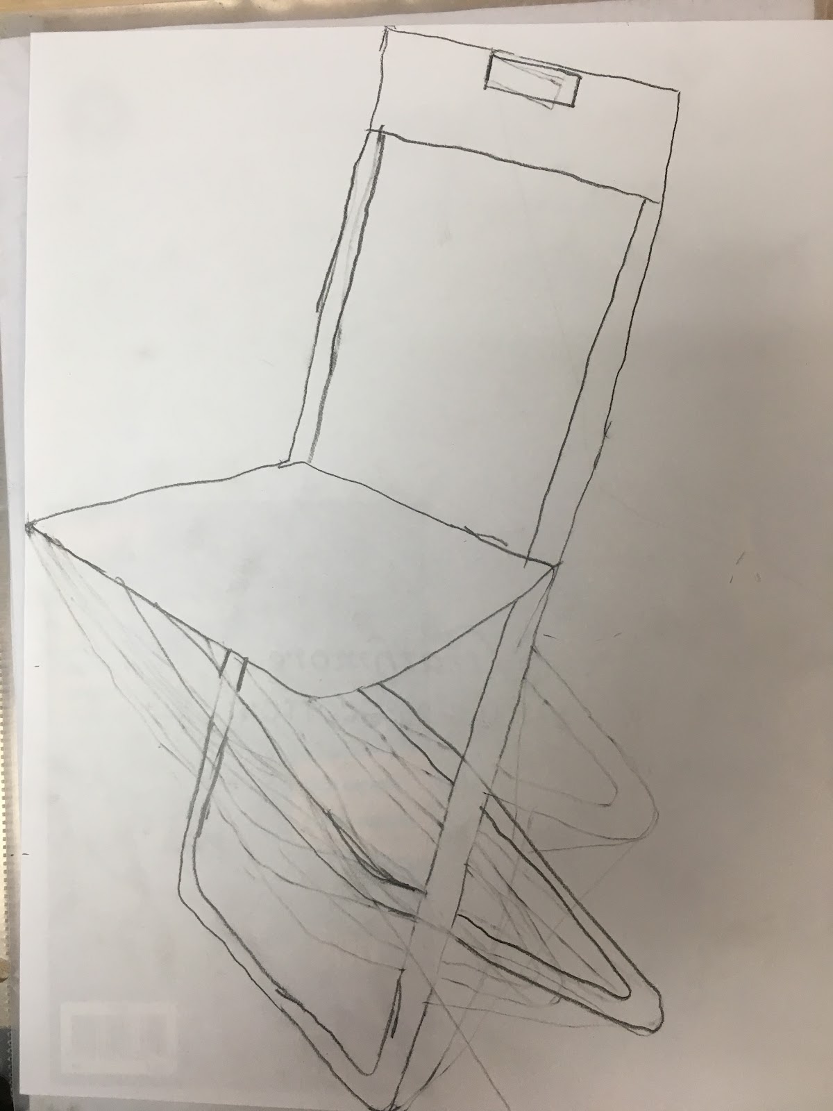
This then left me with the task of viewing an object through it, and beginning to see the spaces around the object in relation to the edges of the hole. I then drew the object, to which I designated a folding chair, and added the details later. However, I soon noticed a problem with this method when I took into account who was holding up the viewfinder. 


Let this be a lesson: 
Never give a man with shaky 
hand the task of holding something 
completely still.

Otherwise, however, after a bit more practice, I thankfully found this method to be very helpful in drawing more realistically. 

Before I sign off, I should point out that these exercises that I have shown are not enough alone to accomplish the book’s goal. These are only the ‘highlights,’ if you will. Still, it’s evident that the book has been very helpful in learning to draw. So far, I would definitely recommend it to anyone who wishes to tap into that inner creative energy. 

Thank you, and take care.

Monday, June 3, 2019

Time to Learn How To Draw! (Guest Post by Ian Vance, Part 1/4)

Time to Learn how to Draw!
Part 1 of 4
Author: Ian Vance, Intern with Arlington Artists Academy at Gallery Clarendon.

Hello there, fellow potential art enthusiasts! My name is Ian, reporting directly from the Arlington Artists Alliance gallery in Clarendon, Virginia. I am an aspiring music major that is currently working as an intern with Arlington Artists Academy at Gallery Clarendon, about to graduate from Washington-Lee High School and soon to be attending George Mason University in the fall. Despite this, apart from music, I have what I would politely refer to as less-than-desirable artistic skill, least of all drawing. The best that I could do up until joining was just making tiny doodles when I’m bored or to accompany presentations at school. 

Yikes.
However, come my first day here working with Mary Jennings, Director of the Artists Academy at Gallery Clarendon, I am given an offer: to begin learning how to draw and blog about my progress each week. I was a little skeptical at first, given my amazing skill with a pencil, but I was handed a book titled Drawing with the Right Side of the Brain by Betty Edwards. From what I was told, it was a very effective tool in developing drawing skills, so I decided to give it a go. I will be reporting on my progress weekly, in four parts, during my internship. 

The book set forth a number of drawing exercises to work through. In the interest in everyone’s time (and to avoid basically spoiling a drawing guide), I will only be referring to a few of the exercises. The first one that I was given was to attempt to draw a face from memory, be it my own (which I chose), or somebody else’s.


Needless to say, I had my work cut out for me, although this was just a means to have something to compare the final results to. Despite that, I sort of just took a step back and chuckled at the… interesting take on a face that my brain seemed to have. 

The book went on to talk about the differences between the left and right side of the brain, where the left was naturally focused on verbal and numeric functions, or, in other words, the boring stuff, while the right was based on spatial and creative functions. Apparently, it’s possible to shift focus to the right side by simply not paying attention to the functions of the left, with which the reverse is also true. 
 
To me, though, the most effective way of learning this mentality came in the form of an exercise in which one copies an illustration upside down. 

 I was quite impressed with the results, and from what I read, so were many other students who did this exact exercise. The primary explanation for how someone with even the least amount of drawing skill can perform much better under these circumstances is that one doesn’t know what they’re drawing. They can’t really assign names or labels to what they see, forcing the right side of the brain (the creative one) to take over. 

Already, I can tell that learning to draw within the next few weeks will at least yield noticeable improvement. I look forward to writing about it. With that being said, I will be sure to keep you all posted. 

Thank you, and take care!

Thursday, August 28, 2014

Feeling Left Out?

We artists all revel in taking our duly-earned "artistic license" - whether we are working from life, from photos, or (for the more intrepid among us) from something we dreamed up in our heads.  We constantly edit as we work, leaving things out, adding things that aren't there, changing and rearranging. These edits may be for compositional reasons ("the chair in this photo is at a very awkward angle and is blocking the figure I'm focusing on - leaving it out"); emotional reasons ("this type of flower brings back powerful painful memories of someone in my past...not going to paint it"); or even physical reasons ("I am physically incapable of painting these hands. They are going behind this figure's back!").

For the current juried show at the gallery, aptly titled "Left Out," artists were challenged to submit works of art in which they left out certain aspects of - or added to - the original from which they were working. It made for a very varied and compelling show. Take, for instance, our 2nd Place winner by Mary Ryder, a piece in carbon titled "An Innocent Man" at right. Scary, yes? That was Mary's point. Her edits fell into the "emotional reasons" category.

Says the artist of the piece:  "As this painting progressed, I was deliberate about omitting features and items that would connect us somehow to the figure - forcing the viewer to focus on the face, which is quite obviously haunting. Looking at something 'nice' is easy...looking at something disquieting is more challenging. He is 'an innocent man,' yet some are still quick to presume some sort of maleficence or guilt because of his appearance. Isn't it just as likely that he has suffered some tragedy or injustice? Perhaps it is the viewer's empathy,compassion, and humanity that has also been left out."

Artist Judith Landry left things out of her oil painting "Umbrian Way," at left, for compositional reasons.  Says Judith about her choices: "In this Umbrian street scene, I deleted unnecessary details, such as an unattractive red stop sign and street grates and gutters, in order to simplify the composition. I also eliminated several people standing in doorways, to create the impression of solitude and to draw the viewer's eye into the painting by focusing on the old woman walking down the street."

Most art buyers are probably unaware that the finished piece they have purchased is the result of constant, ongoing decisions on the part of the artist, and may differ significantly from the way the piece started. Leaving out is all part of the creative process!

--Sandi Parker, Gallery Underground Co-Director


Wednesday, July 23, 2014

Venetian Laundry Day

Venetian Laundry
by Jane McElvany Coonce
Venetian Laundry is an original watercolor by Jane McElvany Coonce.  It is in the all-media member show for July at the gallery.  Jane took a group of art students to Italy to paint for 2 weeks this spring.  They painted in a lot of the small hill towns of Umbria.  Apparently, Italians don't own dryers, and everyone hangs their laundry out of their windows.   This painting captures  the essence of Italian laundry day!

In watercolor, the artist has to save the white of the paper for the highlights.  So any of the clothing that was to remain white would not have any paint on it until the subtle shadows of the cloth were put in.

There are many interesting pieces of art to see at the gallery in July, but you only have until Friday, July 25 to see the artwork because we change the show on Saturday morning.

We keep a photographic record of all works from each of the monthly shows, so if you ever see anything on the blog from a previous month, don't hesitate to contact the gallery.


Monday, March 10, 2014

Does a painter need Persistence? Jackie Afram answers

I asked the artists at the Gallery Underground whether they needed to be persistent as an artist.  We got a variety of answers about being tested and thwarted but emerging triumphant in the end.


Our first featured artist Jackie Afram shares that the geometry of a mobile phone shot can sometimes be tricky to capture!   Jackie tells us "These two paintings were done from  cell phone photos a friend took while visiting Paris last fall.  It was difficult to catch all the angles in the Tuileries gardens.  The first is a contrast of Blues and  Yellows and the second a contrast of greens and oranges.


 They are titled "Jardin des Tuileries por Nuit" and "Jardin des Tuileries por Jour".  Since they are done in impressionistic style, I framed them in deep gold frames. "

I am sure the frames set these classical paintings off beautifully!

Tuesday, February 18, 2014

The future is where potential lives. - Bryan Jernigan

We asked the artists: February is for Valentine's Day & Loves.  Do you have a favorite 

subject
color
style 
 in which to create? Is this consistent throughout the year or is you work different in the winter?
Do tell! 

This is Bryan Jernigan's answer:

What Conversation? by Bryan Jernigan


 I had an epiphany of sorts a few weeks ago and recently posted it on my Facebook page:  Potential confronts us every day. Who do we want to be? Where do we want to go? And how do we get there? Potential stares us in the face always. On rare occasions we are keen enough to see it, but most of the time it’s fuzzy or lost to us completely. Potential can be scary. The future is an unknown and dark place, but it’s also where potential lives. I see potential in myself and in others, but I don’t have superpowers, so it’s just as unclear to me as it is to anyone else. So many times, it’s grainy, undeveloped, obfuscated. I can see the forms, but I can’t see them in sharp focus – they are often stark and intimidating – unrealized potential always is. But I’m convinced the more effort I give to it, the more I work on bringing clarity to it, the more likely potential will be realized.

Internal Dialogue by Bryan Jernigan

I have connected this understanding to my figurative abstracts and am loving the way they are going. I was fortunate enough to have one of my pieces – “What Conversation?” – chosen by a juror for a show called “Passages: An Exhibition of Figurative Abstraction” that will hang from February 10-March 6 at the University of North Carolina at Pembroke.

I am in the process of creating four more of these types of abstracts for the upcoming “Series” show at the Gallery Underground. I’ve been having a great time with it and find they require no reference photos because they come strictly from my mind and the potential I see in others.

So in answer to your question, my work has tended to be different from season to season, but I think it’s less dependent on the temperature outside and more dependent on the stages I go through as an artist and what type of artistic expression I believe will hold my interest. I recently saw a line that read: “I want to make beautiful things even if nobody cares.” As an artist, I think we all feel the same way.

Thanks for letting me respond. Bryan

Together Forward by Bryan Jernigan


Sunday, November 24, 2013

Marcia Finnerty - Referral turns into honored mission

Marcia Koski Finnerty says " I am currently on a jar kick.  It started as a referral from another ceramic artist friend who didn’t want to deal with making a custom cremation urn for a customer. What’s the problem?  I didn’t comprehend their reluctance to take on this challenge??? I was deeply honored and thrilled at the opportunity to provide the final resting place for a dear loved one; be it person or pet. You can use the jar for cookies, dog treats, pasta, flour, sugar or just display. My ceramic art work is made from ceramic stoneware, dishwasher safe and microwavable.    Then when you move on to the next stage……replace the contents with cremated remains. Scatter, bury, display or re-use it for another event.  These are one of a kind jars and I would love to work with you to design something you won’t find anywhere else."
If you have questions: madeinmud@gmail.com


Saturday, November 23, 2013

Rebecca Croft - Magnificent Colors, Magnificent Palette


Painter Rebecca Croft's comments on her November entry - "After a trip to Tuscany I was so inspired to come home and paint.  I love all of the magnificent colors found in Tuscany from the wine vineyards, to the sunflower fields, to the hay bales.  It's all gorgeous.  You can't be in Tuscany and not notice the magnificent color palette.  This painting would be a great memory for someone that has been to Italy or dreams of going. " 

Friday, November 22, 2013

Deborah Conn - Red Energy


Painter Deborah Conn says "My favorite piece hanging in November's Show is “Red,” the head of a fellow artist at a workshop I attended. I used  paper that I had first painted with thick, white gesso – kind of the consistency of wet plaster – and my brush strokes created strong texture. When I started painting her face, it was so exciting the way she emerged from the page, looking right at me. I think the rough, swirly surface gives her face and flyaway hair the energy that is so much a part of this woman’s personality."

You can see more of Deborah's work at Http://www.deborahconn.com 

Thursday, November 21, 2013

Anya Getter - And sometimes you just feel a little goofy.


Good morning World -
This note from artist Anya made me smile.

"This painting hangs in the gallery right now. I just felt like painting something very goofy. :)
Thanks,
Anya Getter"

Wednesday, November 20, 2013

Jess Kallista - Poetry as Art


“Autumnal Embrace” is a mixed media work inspired by one of my recent poems. This piece explores changing relationships as well as a change of seasons. The photograph at the center of this work was actually taken in early spring of this year, yet the yellows, oranges, and browns, as well as the fallen leaves, evoke a feeling of autumn. I incorporated collage images in this piece, such as eyes, that often repeat in many of my works. That sense of repetition calls to mind the familiar cycle of the changing of seasons as well. Come see this work in person and you will find that the collage continues on the back to cover this entire piece.

“Autumnal Embrace” is currently hanging near my studio in the Red Studios at Art Underground. To set up a studio visit you can contact me via my blog dearsuburbia.com.


Thursday, November 7, 2013

Q & A with Catherine Powers - Solo Artist, November


In honor of Catherine Powers' solo exhibit US 17:  The Scenic Highway, we asked her a few questions.  Read on, learn more about her and her a collection of photographs taken along U.S. 17, the 1,100 mile byway spanning the southeastern United States from Winchester, VA to Punta Gorda, FL.  Join us for refreshments and to meet our featured artist this Friday from 5-8pm.


Q- When did you first call yourself an artist?
Q- What are people most surprised to find out about your work?
    Q- Do you have a favorite time of day to shoot?
    Q- How does your portrait and sporting event work inform your fine art photography?
Q- Do you have a favorite piece in the upcoming show? 
    Q- Is there anything you would like us to know?

Catherine answered:
I started calling myself an artist about three years ago.  I have always loved photography ever since I bought my first camera at age 10.  But three years ago, I realized that I had achieved a level of confidence in my skills as a photographer to create art.  A couple of years before this, I met with a group of fellow photographers that I meet with regularly.  We asked each other what our goals were as photographers.  One wanted to be a wedding photographer, one wanted to make money, another wanted to teach workshops.  I realized then that I really wanted to be a fine art photographer and hopefully one day exhibit my work in art galleries.  So I began earnestly trying to achieve this goal.
For this particular exhibit, US 17: The Scenic Highway, people seem to be most surprised that they recognize the locations or that they have traveled along this highway at sometime in their life.  I had an exhibit of this project in January and so many people at the opening reception shared with me their fond memories of places along US 17. 
My favorite time of the day to shoot is around sunrise and sunset. Although when I traveled working on the US 17 project I could not always shoot at sunrise or sunset, so I tried to shoot with the light and elements presented me at the time. 
My portrait work is not traditional studio portraiture.  I usually take what is called “environmental portraits”, which are photographs of people in their environment.  I enjoy meeting and talking to people, learning something about them, learn stories about their lives, or their towns.  I try to capture their personalities in the photograph.  My greatest pleasure is making a connection with the person and the place that I visit.  My sport photographs began with taking pictures of my kids’ sporting events.  It has been challenging, working in low light conditions during evening or indoor events, or working far from the subject.  But I enjoy learning how to overcome these challenges.  I try to view the sporting event from the perspective of what would make an interesting a photograph (not just a snapshot of my children).
One of my favorite pieces in the show is a black and white photograph called “Shrimp Boat”.  It was taken in Calabash, NC.  So much of US 17 runs along the coast, through small fishing communities.  To me, this photograph exemplifies a typical southern fishing community.

Tuesday, November 5, 2013

Jackie Afram captures the Season with Oil Bars

 GU artist Jackie Afram feels that foliage has always been part of our holidays.  "Surging  Red" is my effort with oil bars to capture the elegance of Poinsettias.  She also worked with oil bars  to create an "Autumn Tapestry."
"Autumn Tapestry" by Jackie Afram

 What IS an oil bar, you wonder?  Jackie says "The oil bars I work with are large, (about 8 inches) fat (about an inch and a quarter) compressed oil paint with some wax.  While I have been using the bars without other mediums or oil paints, these can be used with them. Imagine you kindergarten crayons being a bit more runny so you can blend them.  Detail is a bit difficult but possible.   Clean up is easy; no brushes to wash!"

"Surging Red" by Jackie Afram

Both od these painting will be in the all members show at the Gallery Underground in November.  Come see them up close!

Sunday, November 3, 2013

Linda Maldonado's "Shimmer Leaves"

First in a series of Gallery Underground Artists thoughts on their November offerings for the All Member Show.


"Shimmer Leaves" by Linda Maldonado
Linda Maldonado thoughts on "Shimmer Leaves"
"Autumn leaf colors so inspire me, leading to my abstract "Shimmer Leaves." I used iridescent and interference paints and collage elements to interpret the light and radiance of the leaves. I enjoyed creating a blend of realistic and geometric elements, though photos never quite capture the glimmer of gold, copper and silver as they appear in when viewed in person."

Friday, November 1, 2013

US 17:Traveling the Scenic Highway - with Catherine Powers

Exhibit: “U.S.17: Traveling the Scenic Highway”, a solo exhibit of photographs by Catherine Powers
Dates: November 1-24
COST: FREE

Reception:  Friday, November 8, 2013, 5-8pm

This month, Gallery Underground features the work of Catherine Powers in our Special Exhibition Space.  Catherine Powers is a portrait and fine art photographer in the Washington, DC area.  Her belief is that photographs should tell a story.  She uses a blend of photojournalism, editorial and fine art photography, combining composition, color and light to create images that are contemporary and natural.
This exhibit features photographs taken along U.S. 17, the 1,100 mile southern byway that traverses marsh-lined rivers, pristine white beaches, quaint fishing villages, small farms, proud military towns, large cities, and historic communities.

Twilight, Cherry Grove Fishing Pier, SC, by Catherine Powers


Wednesday, October 30, 2013

What a great Kick-off!

The  Gallery Underground celebrated the kick-off of its popular weekend-long event The 3rd Annual Arlington Artists Alliance Studio Tour by a rousing Gallery reception and studio crawl through their Cyan, Red, and Blue Studios in Crystal City,   

Lucky attendees got to visit the working studios of all of the Studio Underground members and take a last look at Mary D. Ott's show, "Grass Etchings and Paintings show.

Blond Power at the Gallery photo- Wen LePore


photo- Nancy Murphree Davis
Blue Studio in action

B. Jernigan mid motion in the red studio photo- Jessica Kallista


Our "friend of the arts" James George, gave us his reflections in an article for the .Examiner.

Wednesday, October 2, 2013

Q & A with Mary D. Ott - October's Featured artist


Mary D. Ott, October's featured artist took a few moments to answer some questions for us before her opening Friday night-


Q- When did you first call yourself an artist?

A- I first started to take art lessons—at the Torpedo Factoryin 1991. I started to consider myself an artist in 1995 when I sold my first painting at the Art League student show.

Q- What are people most surprised to find out about your work? 

    A-Most people have no idea about what is involved in printmaking. They are surprised        when I explain the processes to them.

Q- Do you have a favorite color palette? 

A-My favorite colors are blues and greens, as well as reds and orangesyou can see that in the works in my show.

Q- Do you have a favorite piece in the upcoming Grass Etching and Paintings show? 

A-My favorite piece is "Wide Grass." It turned out just the way I was hoping it would.


Q- Is there anything you would like us to know? 

A-The idea for the "wide grass" etching plate came from the way I create my grass paintings. 


This special Gallery Underground exhibit features two related bodies of work:

Ott created the “grass paintings” by dipping embroidery thread in acrylic paint and running the thread down the canvas. The thread acted as a fine brush, producing lines that look like blades of grass.


The “grass etchings” were all printed from the same “wide grass” etching plate but on different types of paper, with different colors of ink, twice on the same piece of paper, through two layers of paper, and so forth. Some of the etchings appear realistic, while others are abstract in nature.  

Come meet Mary and many of the Gallery's resident artists this Friday October 4th from 5 to 8!

Monday, September 30, 2013

Leaves are Rustling and the Gallery is Bustling!

Congratulations to Patricia Andril, Gallery Staff Favorite for the month of September for her pencil drawing "Chesapeake Water Ballet." It's an honor to be a staff favorite, given the caliber of work the Gallery Underground members exhibit every month.  Who will be the Staff Favorite for October?  Stay Tuned!

October is a BUSY month in the Gallery - Here are a few of the upcoming events!


Grass Etchings and Paintings, solo exhibit by artist Mary D. Ott.  In our Special Exhibitions Space
Gallery Underground All Member Show in the main Gallery
Friday, October 4, 5-8pm, Opening Reception for Grass Etchings and Paintings.  Meet the artist and learn more about her unique creative process.  FREE
Friday, October 18, 11am-12:30pm, Dance Performance by the Indian Dance Educators Association (IDEA).  Head to Gallery Underground on your lunch break where IDEA will present a preview of their upcoming program “Silver Screen: Celebrating a Hundred Years of Indian Cinema through Classical Dance.”  FREE
Friday, October 25, 5-8pm, Opening Reception for The 3rd Annual Arlington Artists Alliance Studio Tour.  Join us at Gallery Underground to Celebrate the kick-off of this popular weekend-long event.  All of the participating artists will be here with a sneak peek of their work.  Pick up your Studio Tour Map and plot out your route for the weekend.  FREE
Saturday, October 26 and Sunday October 2710am-5pm, The 3rd Annual Arlington Artists Alliance Studio Tour in our Cyan, Red, and Blue Studios in Crystal City, and throughout Arlington.  Visit the working studios of 23 local professional artists.  Learn about their creative process and purchase never-before-seen art fresh off the easel. For more information and to download the map go to www.arlingtonartistsalliance.org/events.